Fleet platform
One company, one design team, two products: a telematics ecosystem trusted for over 20 years — and a next-gen fleet-management platform heading to public launch. I owned the product experience across both, end to end: research and a pre-release UX audit, legacy modules redesigned, new ones shipped, and the design foundation rebuilt underneath so a small team could do all three at once and hit the launch date.
Product names, internal metrics and unreleased work are withheld under NDA, so this case covers the domain, my role, the process and relative outcomes only. If you'd like to go deeper on the approach and the decisions behind it, get in touch.
The context
The company behind the project runs one of the world's largest fleet-digitalization ecosystems: millions of connected vehicles across 160+ countries, thousands of partner companies and device types.
Two products, two speeds, one design team covering both: a flagship carrying two decades of interface history, and a next-gen platform heading to public launch. A product this capable deserves an interface that communicates it — raising the design quality to match the engineering underneath was the opportunity the launch created.
It is also a B2B2B product, which shapes every decision. The platform is sold through partners, operated by fleet businesses, and used daily by managers and operators whose goals don't align neatly: the reporting a fleet owner wants can be exactly the data entry that slows down the person in the depot. Most design decisions here are a trade-off between business objectives, operational efficiency, usability and what the platform can technically support.
- A fixed launch date — design quality and delivery had to move together, at pace.
- Two decades of accumulated patterns — tables, modules and conventions built up over the flagship's lifetime.
- Fragmented design practice — new features started in separate files and parallel libraries grew alongside them, so no single source of truth existed for either designers or engineers.
- Users a step removed — sold through partners and operated by their customers, so validation had to be assembled rather than simply asked for.
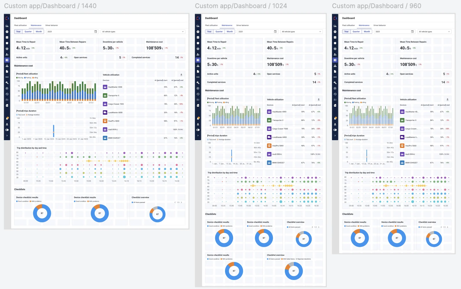
The kind of surface the platform is made of — dense, operational, and specified across widths rather than drawn once and adapted later.
My role
Responsible for improving the product experience across both products while establishing the design practices that let it scale — leading the design team at full design load, hands-on throughout.
I own the product experience across both products — the new platform and the 20-year flagship — along with the audit backlog, the research practice and the design system underneath them. The role reaches past design too — working across product definition and requirements with product management and business analysis, and running design review after development, not only before it.
- The product experience across both products — flows, architecture and interaction, end to end.
- Pre-release UX/UI audit → prioritized quality backlog.
- Research — usability tests, IA surveys, competitive analysis.
- The design foundation — one reference library and the process that keeps it current.
- Design leadership & hiring — directing and supporting the team, and growing it.
Product design
- Shaped module flows end to end — from the problem framing through to the shipped interaction.
- Turned the pre-release audit into a prioritized backlog, owned jointly with product and engineering.
- Work across product definition and requirements with product management and business analysis.
Design leadership
- Set the design direction both products are held to, and keep the standards documented.
- Established the shared pattern library as the reference for new and legacy work alike.
- Direct and support the design team; hiring and quarterly planning.
Technical collaboration
- Storybook aligned with Figma, so design intent and implementation stay in step.
- Implementation guidelines and documentation engineering can build against.
- Design QA and review against the built product, not only before build.
Hands-on execution
- Moderated usability testing on real prototypes, IA surveys, competitive analysis.
- UX architecture, interaction and UI design across redesigned and new modules.
- Interactive prototypes generated from Figma and used in real test sessions.
The whole chain, not a hand-off point in the middle of it.
An audit is only useful if it becomes a backlog. Every finding shipped as Problem → Solution — and the top items are already in production.
Audit → backlog
A full pre-release UX/UI audit of the new platform — hierarchy, navigation, tables, states, iconography.
Every finding framed as Problem → Solution and turned into a working quality backlog, prioritized with product and engineering. The same discipline was then applied to the 20-year flagship and its legacy UI.
- Confirmed "was → now" fixes shipped in production.
- Legacy product audited into a prioritized improvement backlog.
- WCAG 2.1 AA adaptation of the library ahead of the European Accessibility Act.
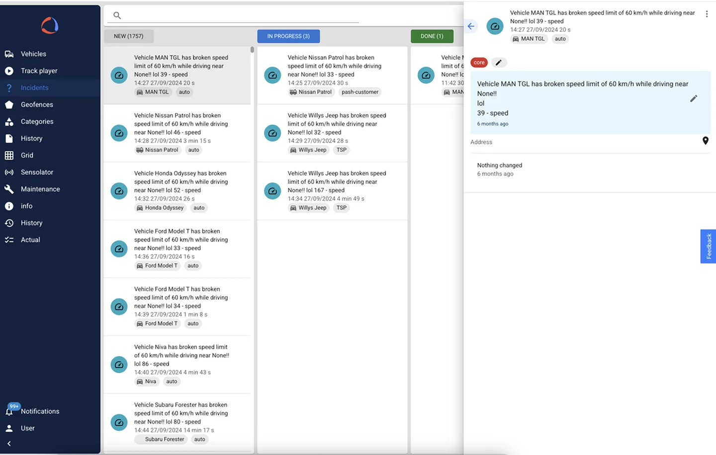
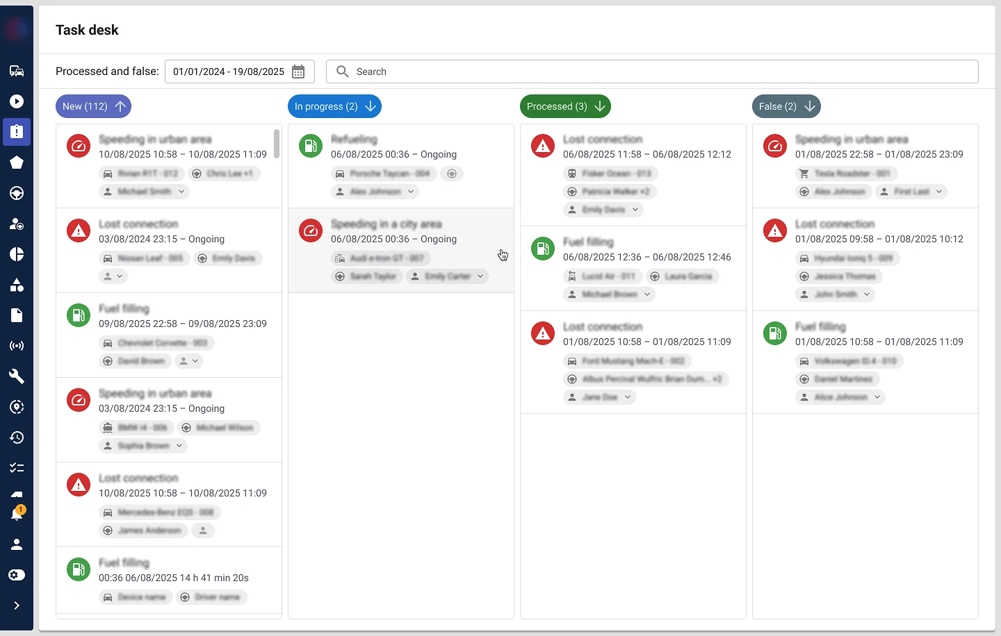
One item from the quality backlog, shipped. The card went from a single run-on sentence to a typed structure — category icon, time range, and vehicle, driver and assignee as separate chips — while the board gained filtering, per-column counts and the state the workflow was actually missing: false alarms, kept apart from processed ones.
One reference library
As the platform grew, design practices had spread out: new features started in new files, and parallel libraries appeared alongside them. I rebuilt the foundation — components, tokens and the process governing both — so consistency stopped depending on who remembered what.
Foundations first: typography, colour, spacing, shadows, radius and icons defined as a token layer, with contrast and accessibility checked at that level rather than per screen. Components were then rebuilt on top, so a fix to a foundation propagates instead of needing to be found in six places.
Fewer libraries was only half of it. The other half was making the system findable and current: one predictable structure for Figma projects and files, mockups kept in step with what has actually shipped, and a defined process for how the library gets updated and versioned — so "the current design" is one unambiguous thing anyone can reach, designer or engineer.
Storybook aligned with Figma and the Figma project structure rebuilt around it, so design intent and implementation stay in step. The library is WCAG-adapted and machine-readable: token exports and rules files let AI agents assemble screens from real components rather than lookalikes.
- One source of truth — seven parallel libraries replaced by a single reference library shared by design and engineering.
- Project & file structure — one predictable place for everything, so the live design is easy to find.
- Mockups kept current — updated as work ships, so the source of truth stays true.
- Library governance — a defined process for how patterns get added, changed and versioned.
- Storybook ⇄ Figma alignment.
- Tokens + rules for the AI-assisted workflow.
- Accessibility built in, not patched on.
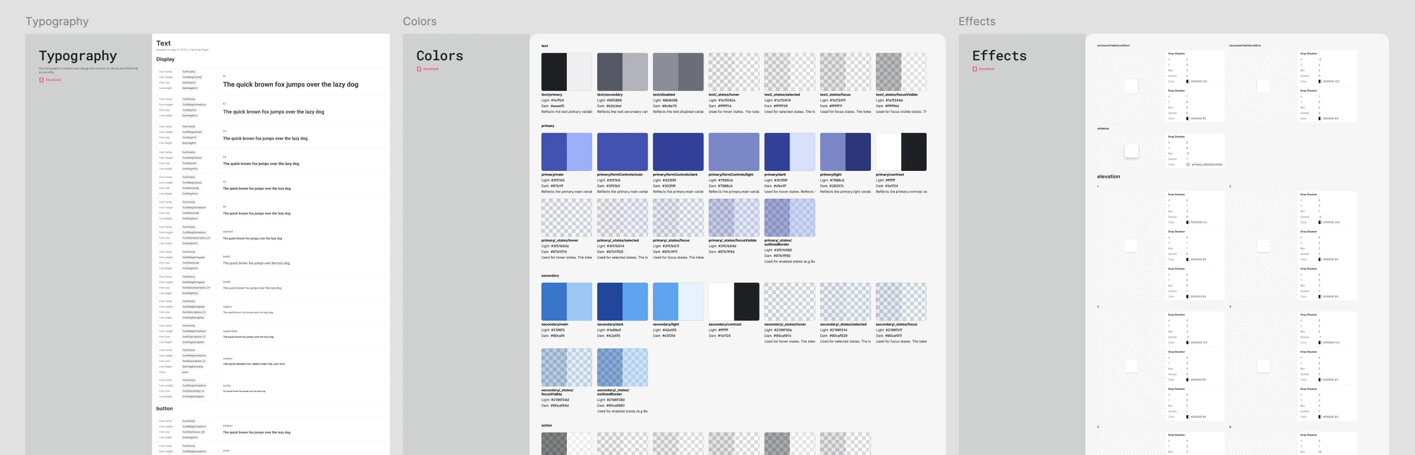
Foundations documented in Storybook — typography, colour and elevation as a semantic token layer rather than a palette: every token carries its meaning, its light and dark value, and its interaction states.
Architecture, tested
Across both products the work isn't divided into private territories — the design library runs through every module, so I'm accountable for how the whole surface behaves rather than for a list of screens.
That makes information architecture the first decision, not the last. Map the structure properly and a new module has an obvious place; get it wrong and every addition renegotiates the navigation. Concepts get tested before they reach development, so the structure is argued from evidence rather than from whoever framed it first.
In a B2B2B setup, direct access to the people using the product daily isn't a given — they work for someone else's company. So validation comes from several directions at once rather than one interview round: moderated testing on real prototypes, partner and stakeholder insight, product data, and feedback collected through a documented process instead of ad hoc.
- Information architecture mapped across the platform, so flows are specified against a known structure.
- Moderated usability tests on real prototypes — facilitator / notetaker protocols, A/B prototype rotation.
- IA & survey research and competitive navigation analysis.
- Interactive prototypes generated from Figma and used in live sessions instead of static mockups.
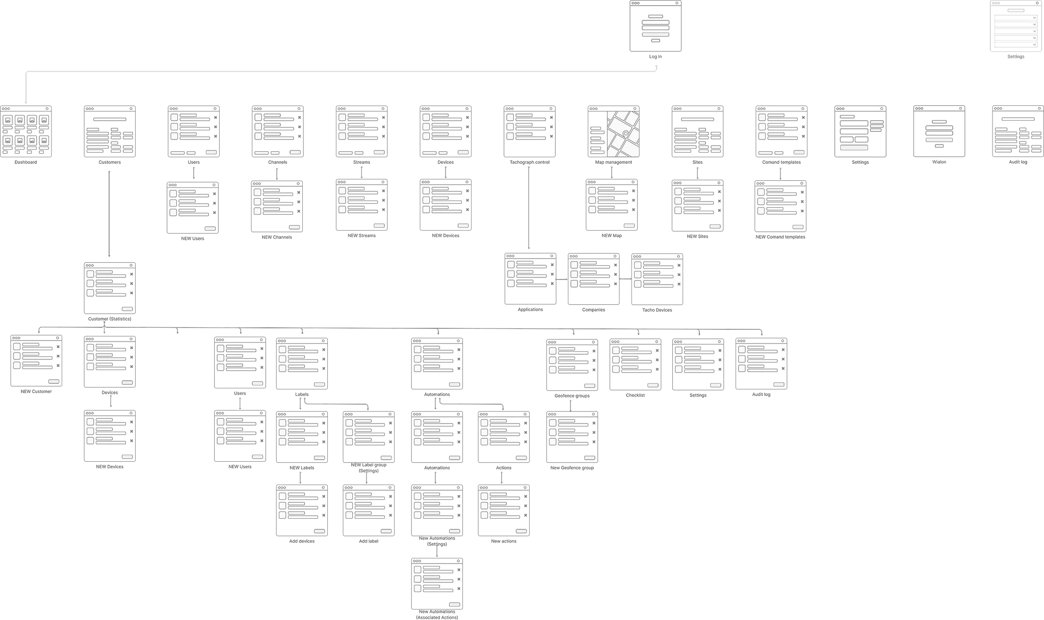
The information architecture the whole platform is specified against — every module placed within one structure, which is what lets the library stay consistent across all of them.
Practices, written down
Two products scaling at once, in startup mode: the way of working has to be built while the product ships. So I wrote the practices down as we went — and I'm still writing them.
Documentation is the deliverable that outlasts any screen. Design guidelines, explicit decision ownership, a Definition of Done that covers the unglamorous states, review practices that carry quality through delivery, and enablement material so engineering can work from the system directly rather than from a hand-off.
Testing became a routine rather than an event — moderated protocols and A/B prototype rotation set up as something the team can repeat without me running every session.
- Design guidelines & documentation — a living reference for patterns, states and usage, maintained alongside the library rather than after it.
- RACI for design decisions — explicit on who decides, who is consulted and who is informed, so ownership doesn't have to be renegotiated per task.
- Definition of Done for design — all component states, empty / error / loading, edge cases, adaptive behaviour, copy and validation.
- Review practices — design review before build and again after it, keeping intent and implementation aligned.
- Enablement for engineering — guidelines and training material so the team can build from the system directly.
- Repeatable testing — facilitator / notetaker protocols and A/B prototype rotation, documented as a routine.
Outcomes
After launch
- Shipped work reviewed against the audit findings it came from, not filed as done.
- Usability testing continued past the concept stage, on live modules.
- Product data and structured partner feedback feeding the next round of the backlog.
What it changed for the business
- A consistent experience across two products that had drifted apart.
- A shorter path from design to shipped code — fewer clarification loops, less rework.
- New features starting from agreed patterns instead of from a blank file.
Launching a platform while auditing its 20-year-old sibling taught me to run two speeds at once: ship the new without letting the legacy define its ceiling.
The foundation is what made that possible — a more consistent experience across both products, a shorter path from design to shipped code, and new features starting from agreed patterns rather than from scratch. Consistency became something the system enforces rather than something the team has to remember.
The system is the multiplier — one reference library, aligned with code, is what let a small team redesign legacy modules and ship new ones simultaneously.
And it doesn't stop at release: what ships gets reviewed, tested and iterated against feedback and product data, so the backlog keeps being informed by what actually happened rather than by what was assumed.