Workspace marketplace
After a series of acquisitions, four marketplace platforms sat side by side under one group — the same core offering, four separately evolved products. Each had grown its own journeys and its own answers to identical problems, which made the group slower to ship and less predictable to use. My role was to define a shared product experience the four brands could run on, without flattening what made each of them worth acquiring.
Client, company and brand names are withheld under NDA, so this case covers the domain, my role, the process and relative outcomes only. If you'd like to go deeper on the approach and the decisions behind it, get in touch.
The context
Global brokerage brand
Global brokerage — 4,400+ cities across ~175 countries.
Coworking-aggregator brand
Coworking aggregator — ~20,000 spaces in 172 countries.
Regional brand
Multi-region, incl. Arabic markets — UAE (Dubai, Abu Dhabi): RTL.
Group / umbrella brand
The parent brand that ties the marketplace together.
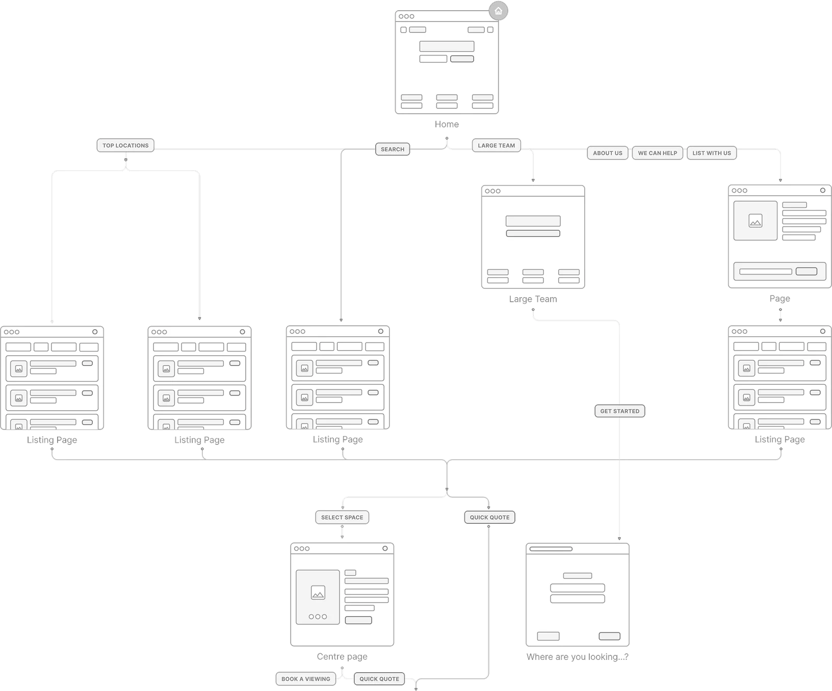
The product is a digital marketplace for flexible workspace — meeting rooms, virtual offices, flexible office space and coworking memberships — running continuously at scale, across devices, markets and languages.
The business grew by acquiring its direct competitors. Each acquisition arrived as a finished product with its own history, so the group ended up running four platforms that sold the same thing in four different ways — and each brand was meant to stay distinct, because its audience and market were the reason it had been bought.
The cost showed up in the product, not in the branding. The same user need had four implementations to maintain; a customer moving between group sites met four sets of expectations; and every new feature had to be specified, built and tested four times. Scaling was the problem — consistency was just where it surfaced.
- Duplicated product work — four teams independently solving the same journey, then maintaining four versions of the fix.
- Inconsistent journeys — the same task behaved differently per brand, so expectations learned on one site didn't transfer to the next.
- Complexity grew with every release — each addition multiplied by four, which made the group progressively slower.
- Differentiation had to survive it — the brands couldn't be merged into one look; their identities and markets were the asset.
My role
I joined as a Senior UX/UI Designer and grew into Design Lead. What I owned was the product experience across the four brands: which journeys had to behave the same everywhere, which decisions each brand kept for itself, and how both could hold while the group kept shipping.
I worked as a senior individual contributor with a leadership remit — setting direction through decisions and standards rather than through process. Getting four product teams onto one set of patterns was a matter of establishing them clearly, arguing them from evidence, and making them concrete enough for engineering to build against.
- The shared product experience — the search-to-enquiry journey and the patterns behind it, across all four brands.
- Cross-brand alignment — bringing product, BA and engineering to one agreed set of patterns, and documenting the decisions so they held without me in the room.
- Scalable foundations — pattern architecture, states and rules, built in Figma as themeable libraries with variables and variants so each brand could re-skin and localize without forking them.
- Hands-on craft — full design cycles on the hardest flows, wireframes through clickable prototypes.
The brands stay different on purpose — different look, different system, different market. The craft was making one flow work across all of them — right-to-left included.
How we decided what to share
Product audit across four platforms
Walked every brand's search-to-enquiry journey end to end and catalogued what each one did at each step — where four products had four answers to the same user need, and where they had quietly converged already.
Competitor & best-practice research
Desk research and competitive analysis with the business analyst, benchmarking the category rather than porting old screens — so the shared pattern could be argued from evidence instead of from whichever brand was loudest.
Find the repeated workflows
Separated the journeys that recurred across all four brands and carried the business — search, listing, enquiry — from the work that was genuinely brand-specific. Frequency and revenue impact decided what was worth standardizing.
Stakeholder discussions
Worked through with product, BA and each brand's owners what they considered non-negotiable to their identity and audience — so the shared layer was agreed up front rather than defended screen by screen later.
The rule we settled on
Anything that shaped how the journey behaves became shared; anything that shaped how the brand feels stayed with the brand. One sentence, but it resolved most disagreements before they turned into meetings.
Validate before scaling
Proved each pattern on the hardest flow first — wireframes through clickable prototypes, tested and A/B-optimized — and only then rolled it to the other brands. Nothing was standardized on the strength of an opinion.
Shared flow, distinct systems
The system was the answer, not the objective. What the group needed was for the same product decisions to hold in four places at once — so I translated those decisions into patterns teams could build against.
Every brand kept its own design system — its own UI kit, palette and type. What I standardized sat underneath: the user flow, interaction patterns, component logic and information architecture. So the same search → listing → enquiry journey behaved the same everywhere, while each site still looked unmistakably like itself.
That's the balance the project turned on — consistency of experience without sameness of appearance. A change to the journey could carry across brands; each brand kept its recognition; and designing a pattern once, then theming and localizing it, meant a new page started from an agreed position instead of a blank one.
- User flow & IA — the search-to-enquiry journey and navigation logic.
- Interaction patterns — the same behaviours, states and rules across brands.
- Component logic — how a listing card, filter or form works, regardless of skin.
- Accessibility rules — one bar for usability and inclusivity everywhere.
- Brand & identity — logo, tone, imagery kept fully distinct.
- Design system — each brand's own UI kit, colour palette and typography.
- Localization & direction — language and layout, including RTL for Arabic markets.
Search & results
Problem — search was the critical journey on every brand, built four different ways. A customer moving between group sites met different filtering, sorting and result logic each time, and every improvement had to be rebuilt per platform.
Impact — one flexible pattern that each brand themes to its own identity: the behaviour stays familiar across the group, and the journey now has a single place to be improved rather than four.
The enquiry funnel
Problem — enquiry is where the marketplace earns. Each brand had its own step order, validation and error handling, so drop-off had four separate causes and no comparable way to diagnose them.
Impact — one step-by-step pattern with agreed states, validation and error behaviour. Tested once, reused everywhere — so a fix found on one brand carried to the rest instead of stopping there.
Right-to-left as structure, not translation
Problem — one brand serves Arabic markets. RTL mirrors the entire layout, not just the copy; treating it as a translation step would have broken the shared journey the moment it was localized.
Impact — reading direction became a property of the patterns from the start, so the same flow holds flipped. Localization stopped being a per-page repair job and became something the architecture already accounted for.
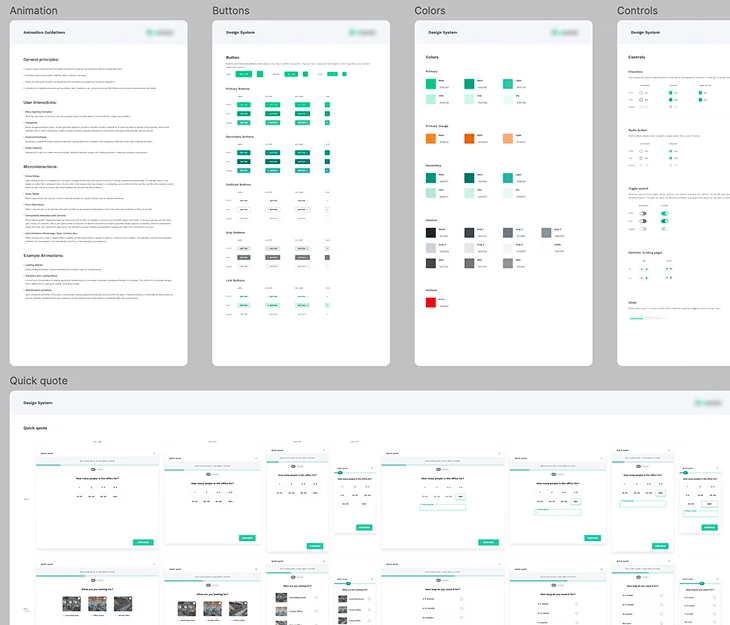
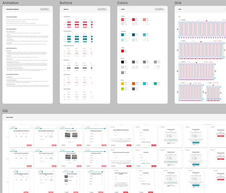
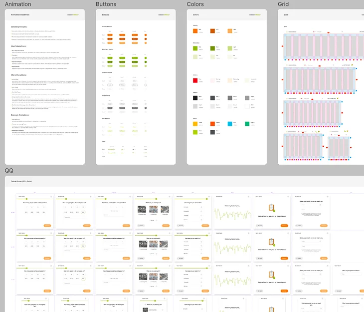
Three brands, three design systems — and, underneath, the same quick-quote flow. Read across: the palettes, buttons and grids are genuinely different, while the documentation structure and the journey they describe are identical. That's the balance the project turned on.
Redesign, tested
On top of the shared foundations, I led the redesign of existing functionality and static pages — and a from-scratch rethink of the core portal functionality.
Working from research and competitor analysis with the business analyst, we reconceived the functionality rather than re-skinning it. I ran the entire design cycle independently — wireframes through clickable prototypes — and every step was optimized against A/B tests and data-driven insights instead of settled by preference.
Because the flows were tested rather than argued, the redesign shipped with measured improvements to task completion and conversion — the figures themselves sit under NDA.
- Core portal functionality — reconceived end-to-end, then built from wireframes to clickable prototype.
- Search & listing flows — the path from browsing workspaces to enquiry, streamlined step by step.
- Static pages — brought onto the system and optimized for clarity and conversion.
- Every step A/B-tested — decisions backed by data, not opinion.
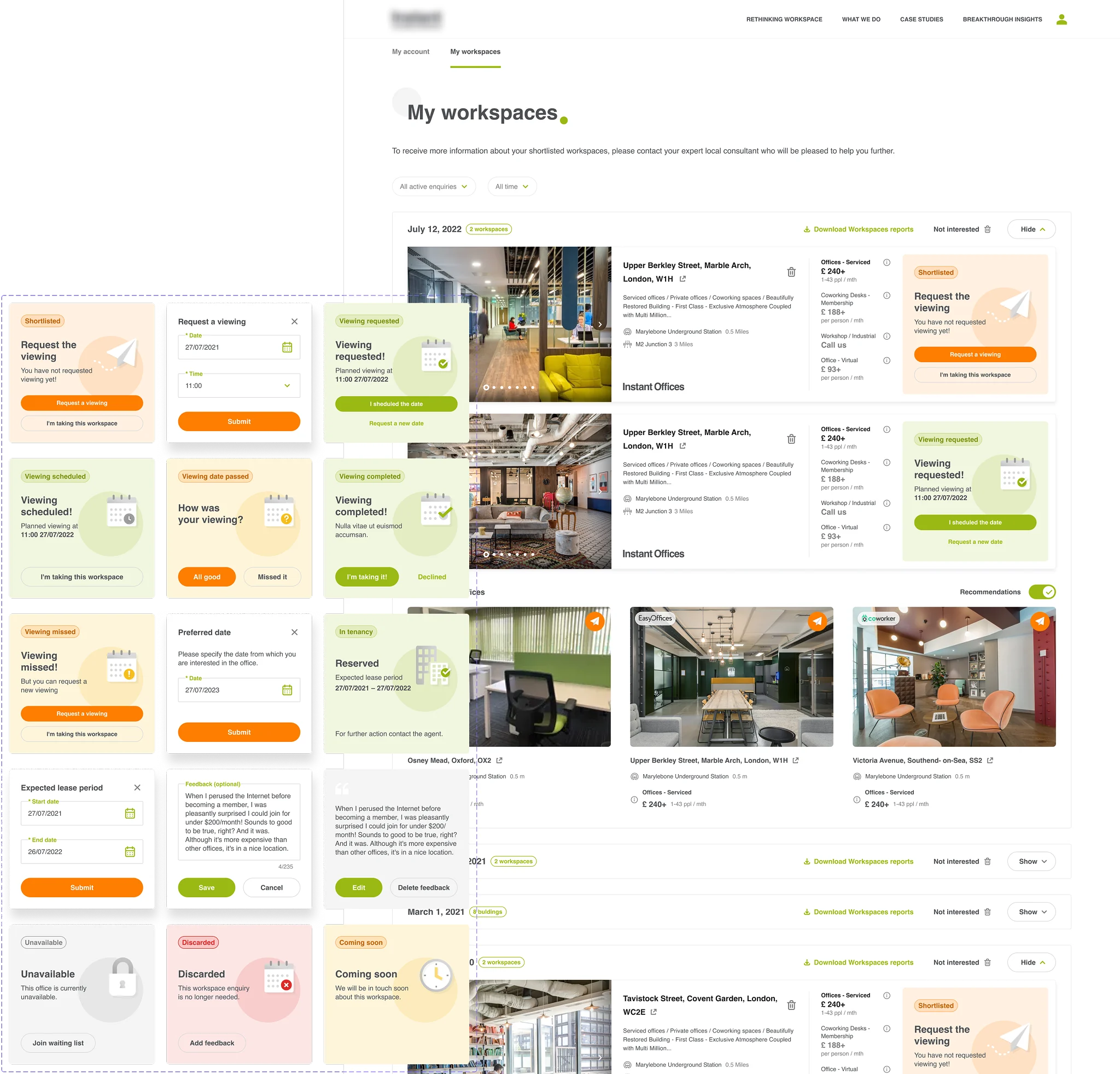
Where the enquiry actually lives after search. Designing this meant specifying every state the card can be in — including the awkward ones: a viewing missed, a date passed, an office gone unavailable — because those are the moments a user decides whether the marketplace is trustworthy.
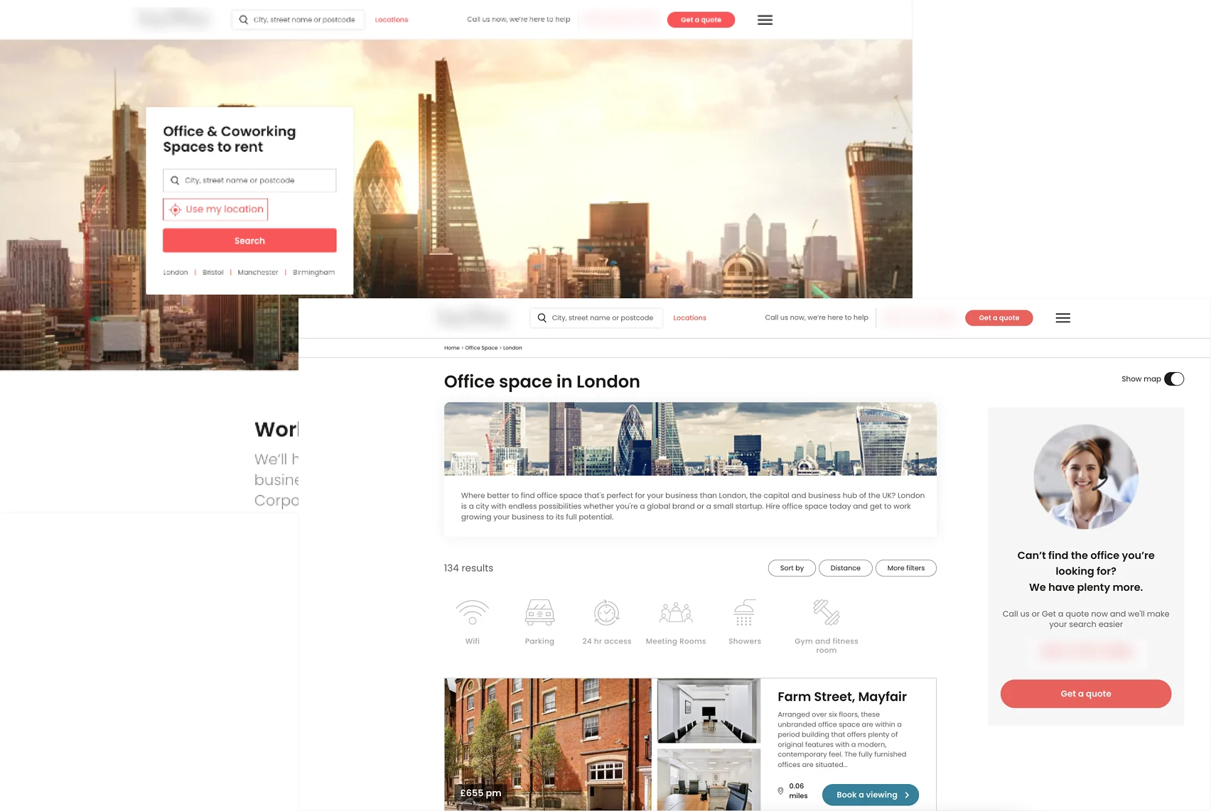
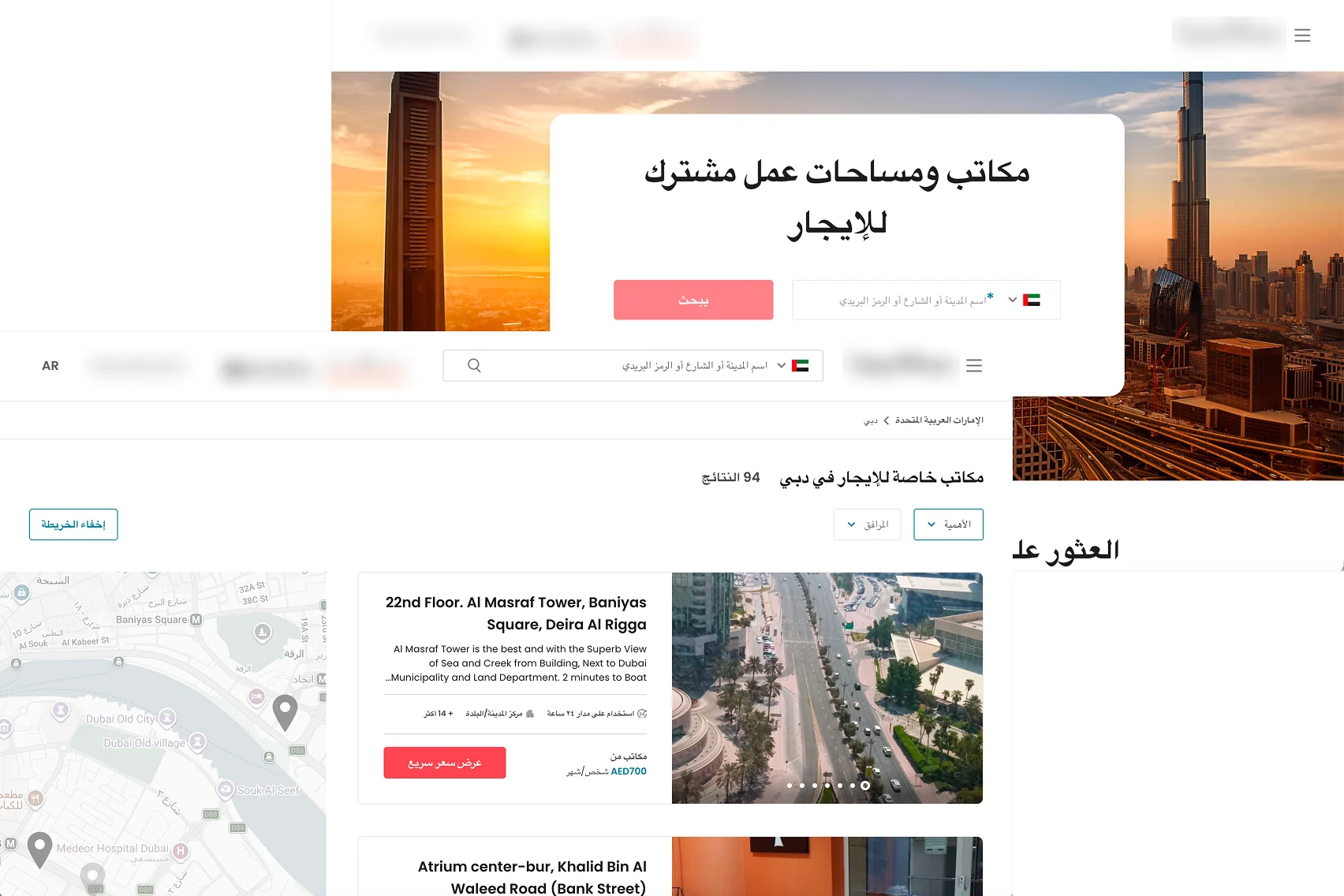
The same search-to-listing journey, before and after. The results page gained a map, real filters and restructured cards; the hero became a single focused entry point. The "now" side is shown in the Arabic right-to-left rendering — the same structure, mirrored, which is the harder test of whether a pattern actually holds.
Adaptive, multilingual, aligned
A marketplace this size has to work everywhere — every device, every language, every reading direction, every touchpoint.
I developed adaptive, responsive systems that scale across devices and platforms, localized across the group's markets — including right-to-left layouts for Arabic markets (one of the brands, serving the Gulf). RTL isn't a translation; it mirrors the whole layout, so the shared flow had to hold up flipped, not just re-labelled. Working across all four sites and their teams at once meant every pattern had to be legible to product, engineering and marketing simultaneously — which is what kept delivery consistent at that scale.
I also designed the supplementary offline materials for the sales and marketing teams — building reports, mapping and detailed reports.
That closed the loop: the experience stayed consistent all the way from a printed building report to the live digital platform, so the brand message and feel held together across every point of contact.
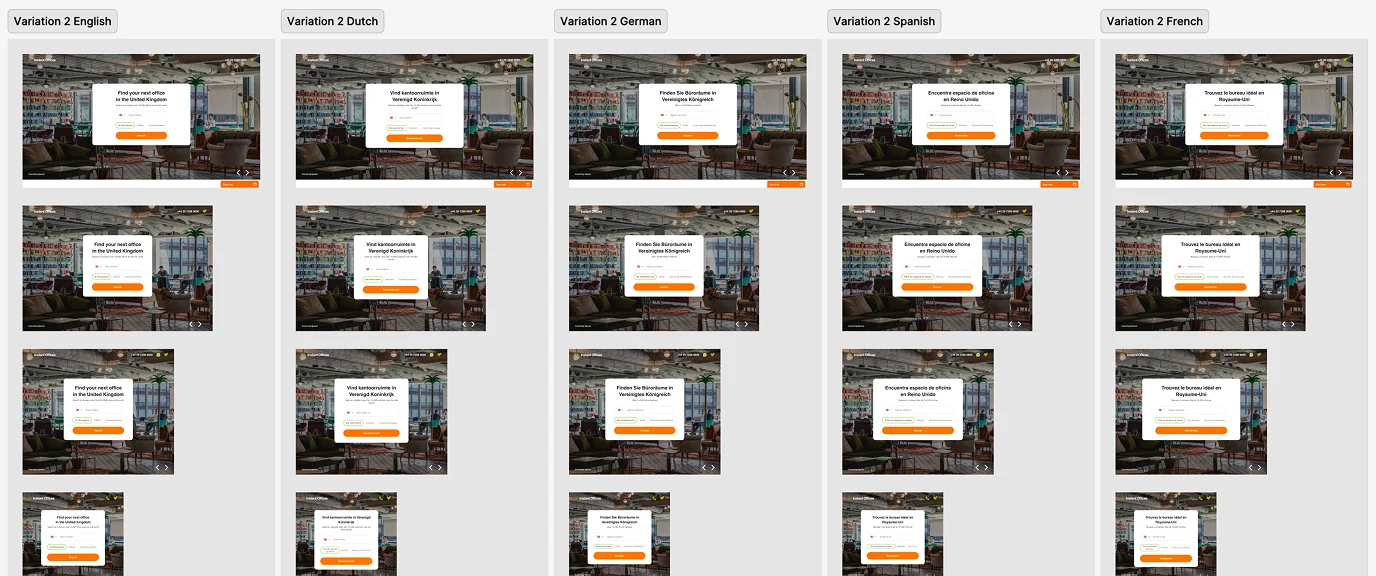
One entry point, five languages, several widths each. Localization isn't only translation — German and Dutch run long, so the panel has to hold its shape when the copy grows rather than being redrawn per market.
Outcomes
The outcome wasn't a shared UI foundation. It was a scalable product framework — four brands able to keep evolving independently while the journey underneath stayed coherent.
Work stopped being done four times. A pattern was researched, tested and agreed once, then themed and localized per brand — which reduced duplication, shortened delivery on new pages, and left one place to maintain instead of four. Accessibility and localization came with the pattern rather than being retrofitted per site.
The engagement ended in 2024. The design has stayed in production since, unchanged — which is the durability test a system either passes or it doesn't.
It also changed what the group argued about. With the shared patterns written down and the sharing rule agreed, product, BA and engineering debated the journey and the evidence instead of re-litigating each brand's version of the same screen — which is where most of the time had been going.
That's the approach I've carried since: define the product experience first, make it scalable second. A system only holds when the teams building on it recognize their own decisions in it.